Selecting the right paint colour for your room can be a bit of a minefield. You finally find a colour for you after spending hours trawling through Pinterest and Instagram and bam it looks completely different on your walls versus the images you spotted online! Instagram filtering aside (we can’t fix this bit for you!) here are some top tips of interior design which should hopefully help you with understanding colour better and how the room, furniture, lighting and orientation (natural lighting) will impact its appearance in your home!
Let's start this mini series with north facing rooms as it's one of the toughest to get right but it's definitely not impossible to create a cosy sanctuary in that north facing room!
Key characteristics of a north facing room:
North facing rooms tend to appear darker and colder because, even if they have large windows that get a lot of natural light they don’t receive any direct bright sunlight. This lack of warmth in the natural light translates into bluer-toned appearance of the items in your space and colours you use making the room feel and appear cooler.
If you have a north facing room, don’t feel disheartened and panicked by the sound of ‘blue tones’ and ‘cold light’. There are actually some benefits to north facing natural light. Without wanting to get too technical it's actually reflected light rather than direct natural light. What this means is that indirect light will actually give a softer light to your room meaning no harsh and crisp shadows. For those of us that are still a little bit lost in this science lesson it ultimately means the room will have a natural sense of calm about it which I would class as a huge win (obviously depending on what you use the room for!) Another key win here is the light in the room will be consistent! It will have the same feeling in the morning as it does in the afternoon which actually can make selecting a colour a little bit simpler!
So now we know we have a room with a sense of calm that can appear cool or blue toned…so how are we decorating it?

Step 1 - Think about the purpose of the room!
Ok so before we delve into selecting a colour for your north facing room, let's think about the purpose of it! It’s no good trying to create a cosy and cocooning space if it's your kitchen where you need to wake yourself up on a morning eating breakfast before heading to work or your home office that you need to ensure you remain alert and energised in. It's so important to think about this first before delving off down a colour selection route!
Step 2 - Think about the furniture or accessories you already have!
Ok so in an ideal world it's lovely to have the funds to get lost down a mood boarding rabbit hole, checking out a whole bunch of new accessories, curtains, carpets or flooring and furniture. In reality it's a rare occasion that we get to start a room from scratch so make sure you’re considering your existing colours before delving into your colour choice. You need to be aware of these for your colour selection to ensure you’re not trying to include too many colours in your scheme (remember the interior design golden rules of 60:30:10!) and more importantly trying not to clash your colours (unless you’re after a maximalist vibe then absolutely go this way!).
Step 3 - Select your Blend!
Ok so we know what the purpose of our room is and what existing colours we’re working with in our furniture and accessories, it's time to select our Blend! Let's talk through how light is likely to impact the colours you choose!
We now know the light in your room will be blue-toned and cooler so any colours with blue, lilac or true grey undertones will appear even bluer in this kind of environment which in turn is likely to make the room appear too cold or flat. Colours with yellow, pink and red undertones will work really well in a north facing room as they will help to neutralise the cooler toned light. Opting for a shade with a little more yellow or red in them may feel worrying for anyone that's a neutral lover at heart but the mix of the warmer shade and the blue, indirect natural light will balance somewhere quite nicely in the middle. So let’s bear this in mind whilst we work out which shade to select!
A light and airy room:
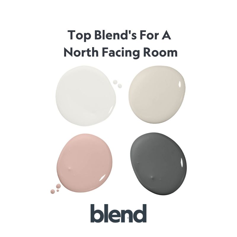
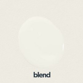
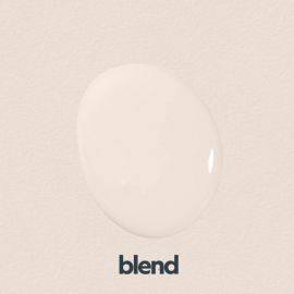
If you’re wanting to lift the space, make it feel bright, airy and inviting then naturally going for an off-white or light shade will be the answer. The key to selecting the right shade here is to be mindful of those undertones. Selecting an off-white shade with a hint of yellow, pink or brown will help to warm up the room and ensure it feels inviting. Try Blend’s Cloudy White, Milky White or Dead Bonny.


A cosy, cocooning room:
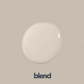
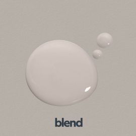
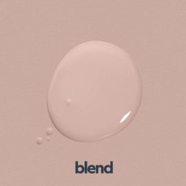
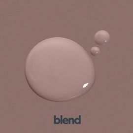
For a warming and cocooning space, mid-toned shades are the answer. Once again we need to be mindful of the undertones in the shades you select, so mid-toned greige or taupe shades would be a great choice here, not leaning too heavily on a blue undertone. Think about Blend Greige Tan which is a greige with a blush undertone, Irish Cream, a taupe with yellow and green undertones or Brownbridge, a warming dusky pink shade with brown undertones.


A bolder statement room:
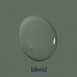
If you’re wanting to inject some colour into your room then don’t be afraid! Actually, the bolder the better! Embrace the darkness of the room and opt for warmer toned bold colours like forest greens, jewel toned blues and charcoal blacks to create your cosy sanctuary! Consider Blend’s Collingwood, 1986 or Cooper which are all warm toned and will create a really dramatic yet cosy effect in your home!


Ready for more?
So there you have it, hopefully a helpful and demystifying guide to selecting the right colour for you and your north facing room! As I’m sure you will have guessed, we’ll be back with South, East and West and our quick guide on how to select the right paint colour for you, your style and your home!
Related Products
-
 Blend Milky WhiteFrom £4.99 £4.16
 -
 Blend Irish CreamFrom £21.99 £18.32
 -
 Blend Greige TanFrom £4.99 £4.16
 -
 Blend Dead BonnyFrom £4.99 £4.16
 -
 Blend BrownbridgeFrom £4.99 £4.16
 -
 Blend 1986From £21.99 £18.32
 -
 Blend CollingwoodFrom £4.99 £4.16
 -
 Blend CooperFrom £4.99 £4.16